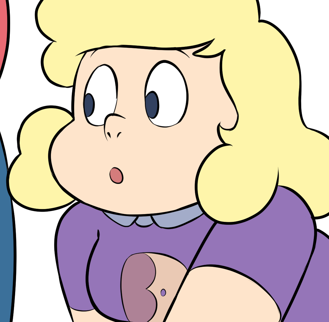
Flat colors
Gem Domination » Devlog
So... This is how the scene potentially looks finished. No shades or further rendering. Why? Well, as usual, try to save time. I'm personally very much into flat colors. But I wonder what you guys think about it. Would you rather have a full render at the cost of roughly more time, or are you ok with flat colors?

Also, sorry for the lack of updates. Still IRL stuff I'm taking care of it, but the content is NOT stopping from being done. It's just taking time to be released, and that's totally on me. Sorry about that, guys.
Get Gem Domination
Download NowName your own price
Gem Domination
Make them or Break them
| Status | In development |
| Author | Amazoness Enterprises |
| Genre | Visual Novel |
| Tags | Adult, Dating Sim, Erotic, Fangame, Male protagonist, NSFW, Romance, Sandbox, sexy |
| Languages | English |
More posts
- Gem Domination News76 days ago
- Gem Domination 0.12.2Jul 14, 2025
- Gem Domination v0.12 for high tier supportersJul 01, 2025
- Gem Domination v0.11.1Feb 10, 2025
- Remade Scenes and More new SpritesDec 15, 2024
- News, and announcements!Oct 25, 2024
- Gem Domination v0.10.4Aug 22, 2024
- Huge DevlogMay 24, 2024
- Connie animationFeb 29, 2024
- Twins and Galaxy WarpDec 06, 2023

Comments
Log in with itch.io to leave a comment.
I like how it is now so I like the flat color better
It mostly gits the original style of the show anyway, so i'd say it good
Probably fine, I like the flat style anyways, it better matches the show. At least we're getting Sadie
As long as it doesn't mess with the animation design, flat should be fine. 👀
Flat is good